
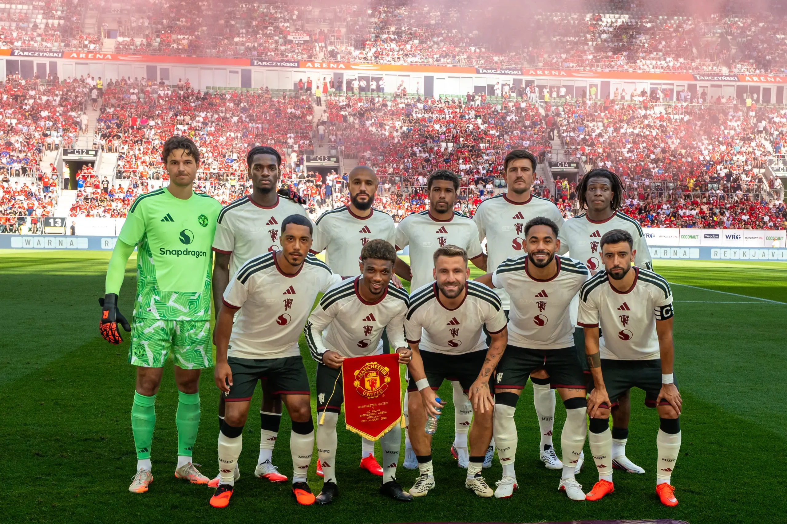
Here’s why Man Utd had to make a big change to their new kit for Champions League matches.

Manchester United has to make a small change to their new ‘three-pronged’ third kit when playing in this season’s Champions League to follow UEFA rules.
The club recently showed off their new third kit for the 2026-27 season. It’s a tribute to Manchester’s youth culture, local pride, and community spirit. The shirt, shown in the picture below, has a cream base with dark green and red details, badges in the middle, and a floral design at the bottom.
What really stands out is the crest and the Snapdragon logo placed right in the center, a cool look that fans have been loving. But while the shirt will be worn in home matches this season, UEFA rules say the ‘Snapdragon’ wordmark has to be added to shirts for Champions League games.
UEFA wants all logos on a club’s kits in the tournament to be the same, so the sponsor on this third kit needs to match United’s home and away kits, which already feature the wordmark.
Earlier this month, Adidas design director Inigo Turner shared some cool details about the kit’s design, first seen in United’s pre-season game against AC Milan in Poland. He explained, “The colors aren’t random. Around Manchester, you see them a lot in the city’s old buildings and architecture. The red on the shirt reflects the city’s famous red brick, while the green stripes represent things like green pipes and windowsills on famous landmarks.”
One building that inspired the colors is the Salford Lads and Girls Club, a place that’s helped many kids with sports and music for generations.
Turner added, “The colors come from the city’s geography, but the real story is about youth. Manchester has had these youth clubs for over 100 years supporting working-class communities, and that’s a big part of the city’s spirit.”