
Every Premier League home shirt for the 26/27 season gets rated, with two clubs scoring a perfect 10/10!
To buy or not to buy—that’s the big question!
With the Premier League season about to kick off, lots of fans are wondering if they should grab the new home shirt for the exciting 2026-27 season.
Most clubs revealed their kits in late May or June, but Sunderland made fans wait until July 29 for their big reveal at a pop-up event in New York. And trust us, it was worth the wait!
So, which shirts look the best? And why did Bournemouth’s kit get voted one of the worst in Premier League history despite its “subtle” design? Here are our ratings, including perfect 10/10 scores for Sunderland and newly-promoted Coventry City.
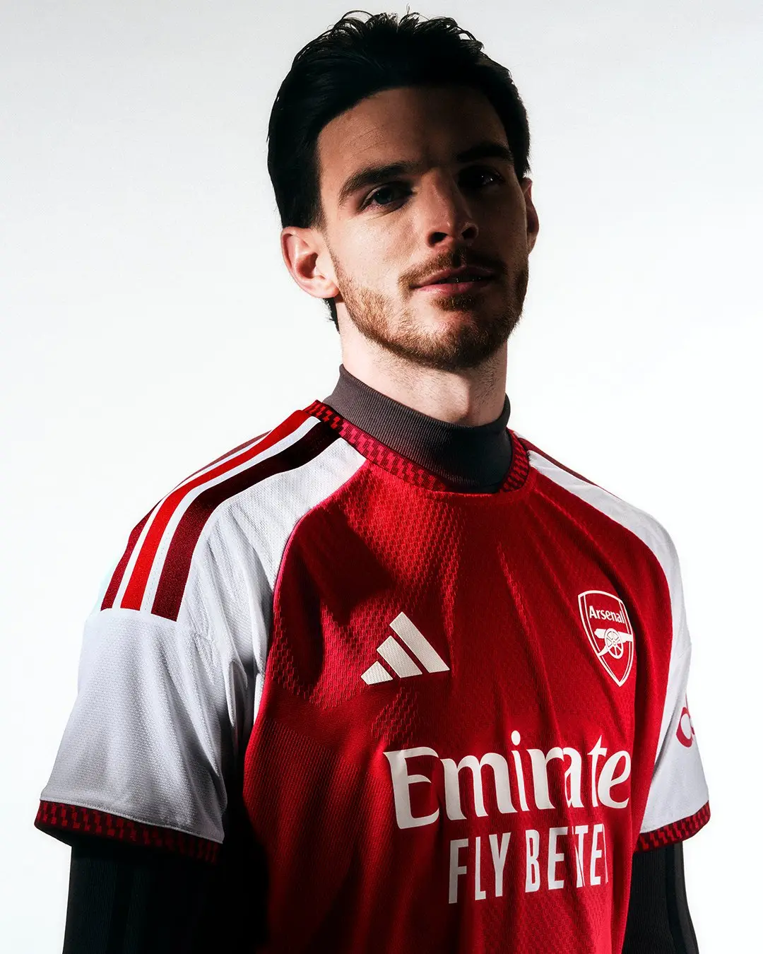
**7.5/10 – Arsenal**
Arsenal showed off their shirt in mid-May, right after winning the Premier League for the first time in 22 years. It features a clever collar inspired by the Emirates Stadium and a subtle pattern adding depth. A solid choice for the champions!
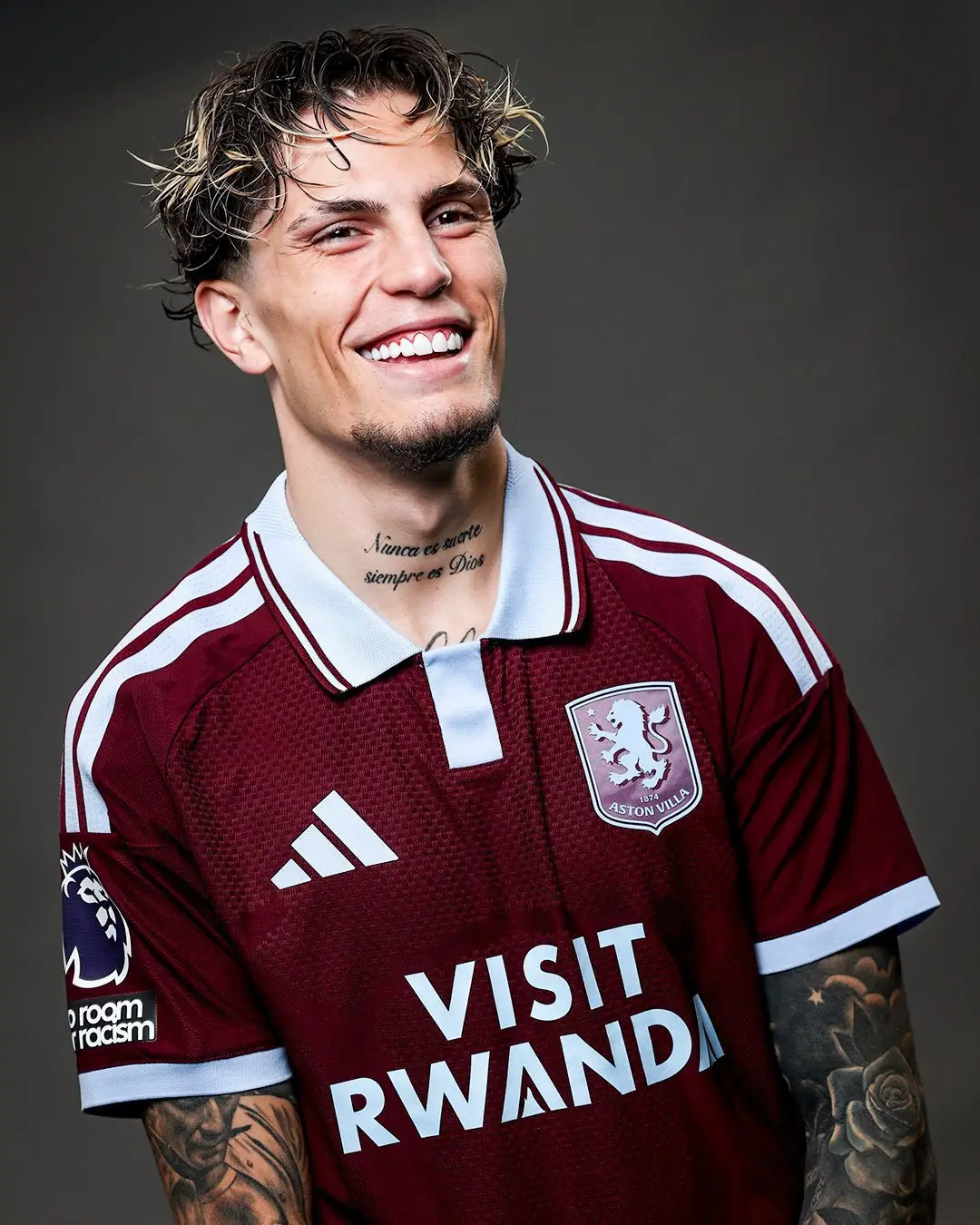
**8/10 – Aston Villa**
Villa went for a retro vibe with three-stripe detailing on the collar, honoring classic claret and blue styles. The clean look moves away from their usual modern raglan sleeves. Stylish, especially on new loan signing Alejandro Garnacho!
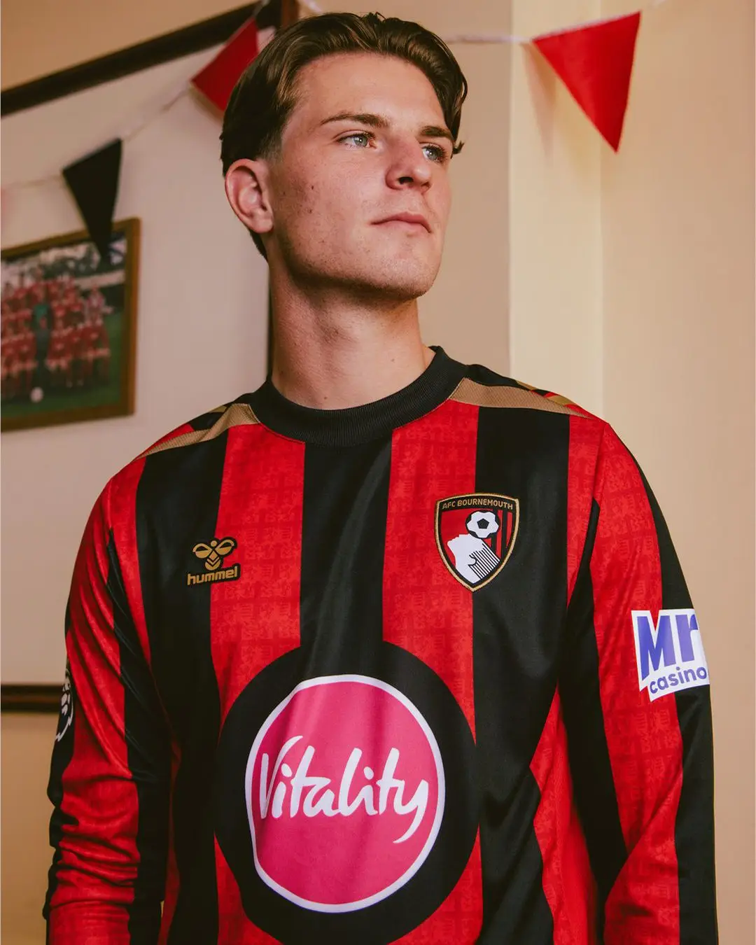
**5/10 – Bournemouth**
Bournemouth’s new kit is inspired by the classic wider red and black stripes. But the big sponsor logo really stands out—and not in a good way. Hummel did a good job with the gold details, though.
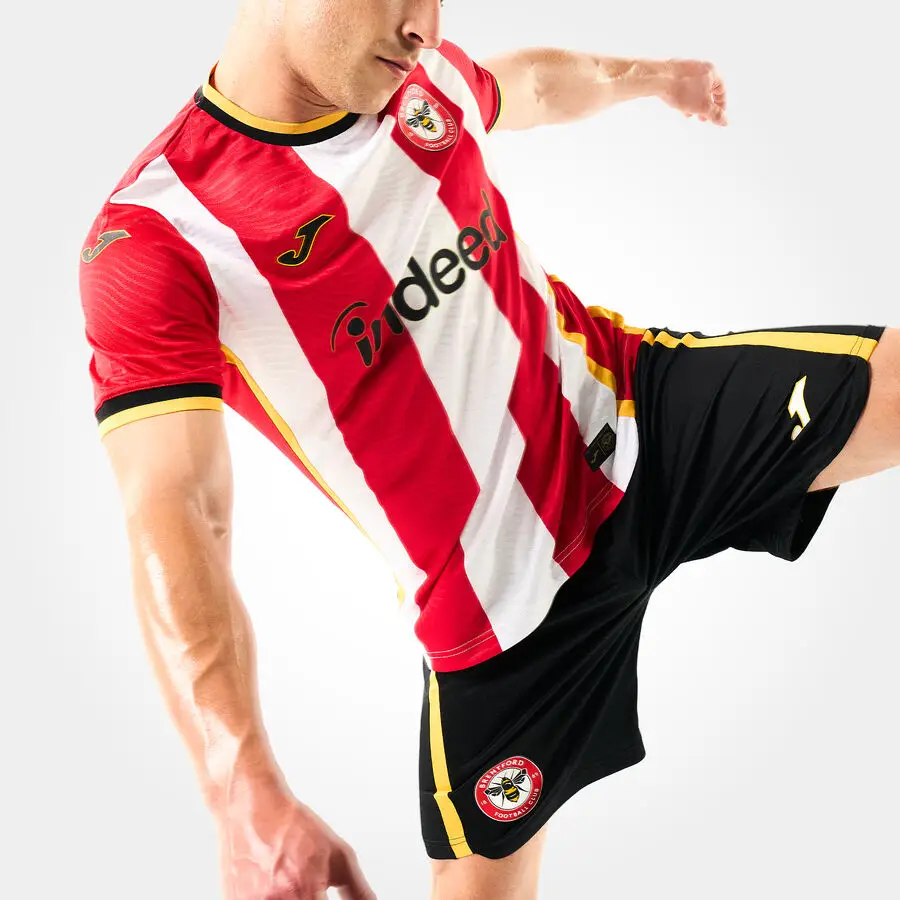
**8/10 – Brentford**
Brentford focus on affordability and sustainability again, this time with a kit made with new partners Joma Sport and Indeed. The red and white stripes get a pop of honey yellow around the collar and cuffs. Nice and fresh!
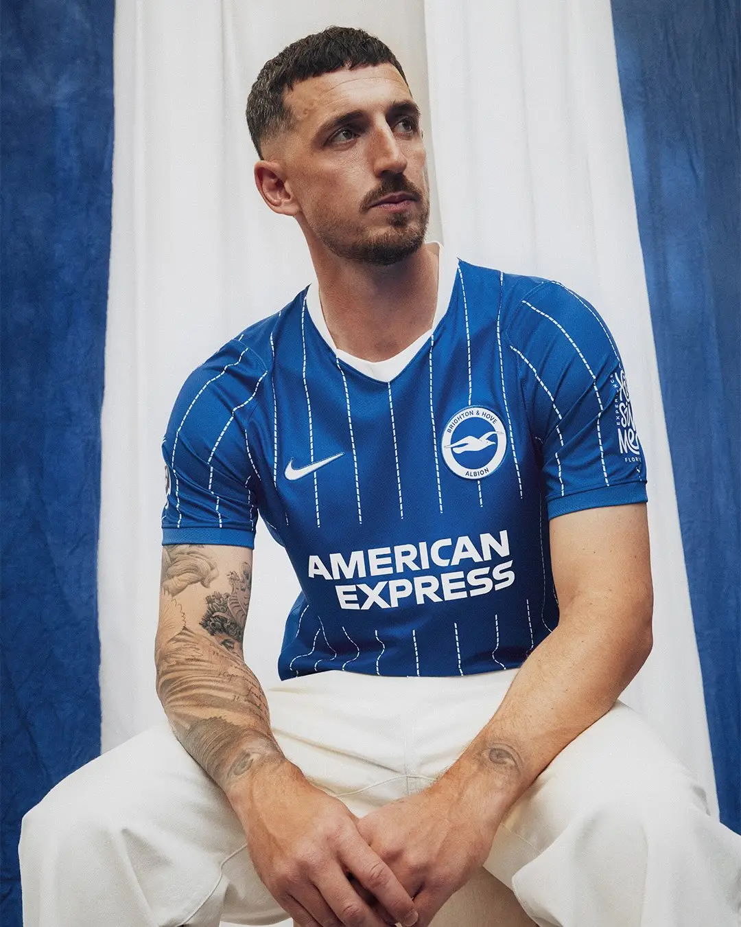
**7.5/10 – Brighton**
Brighton’s shirt takes inspiration from their 1983 FA Cup final appearance. The white pinstripes and neckline give it a clean, classic feel we like a lot.
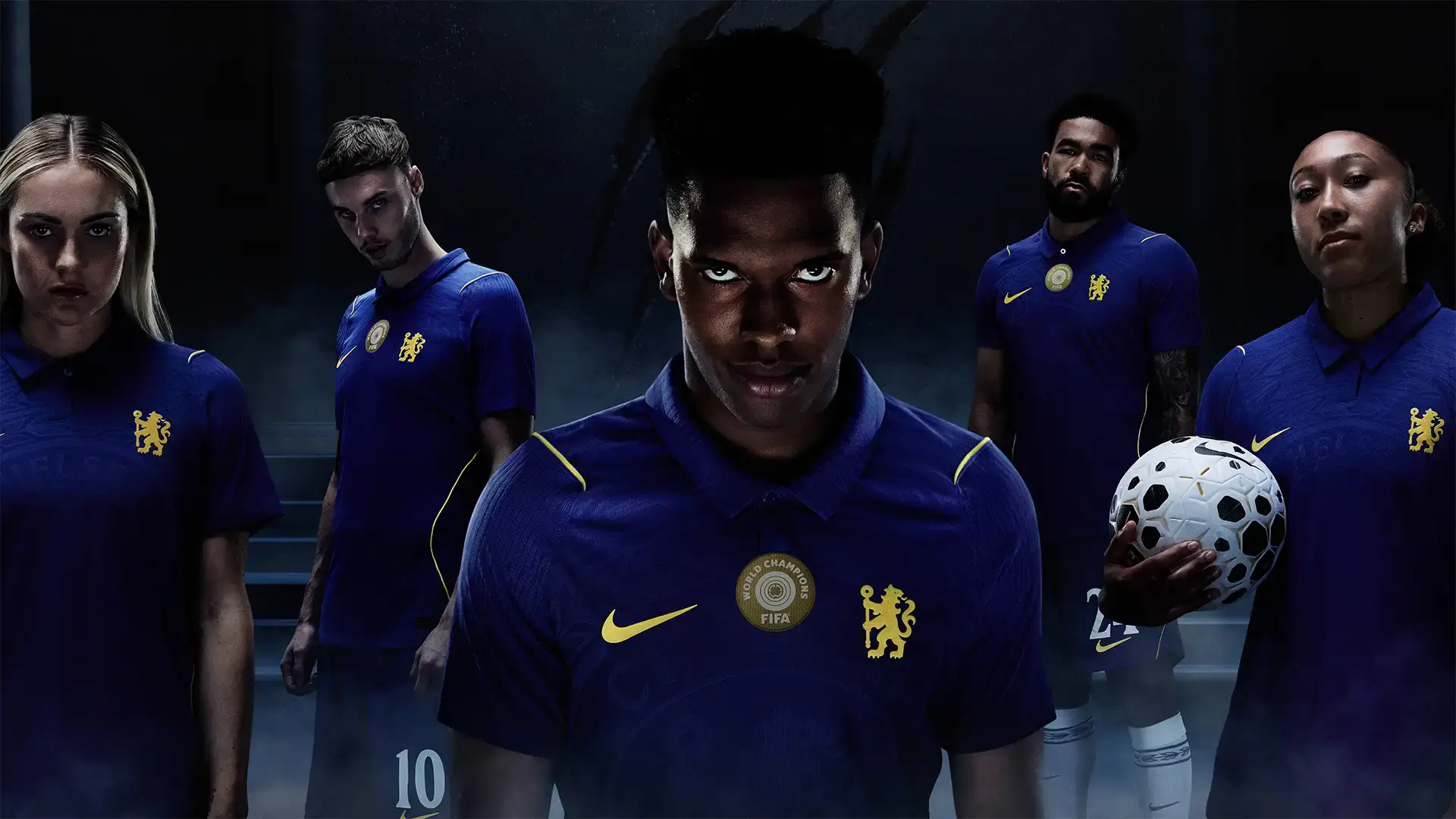
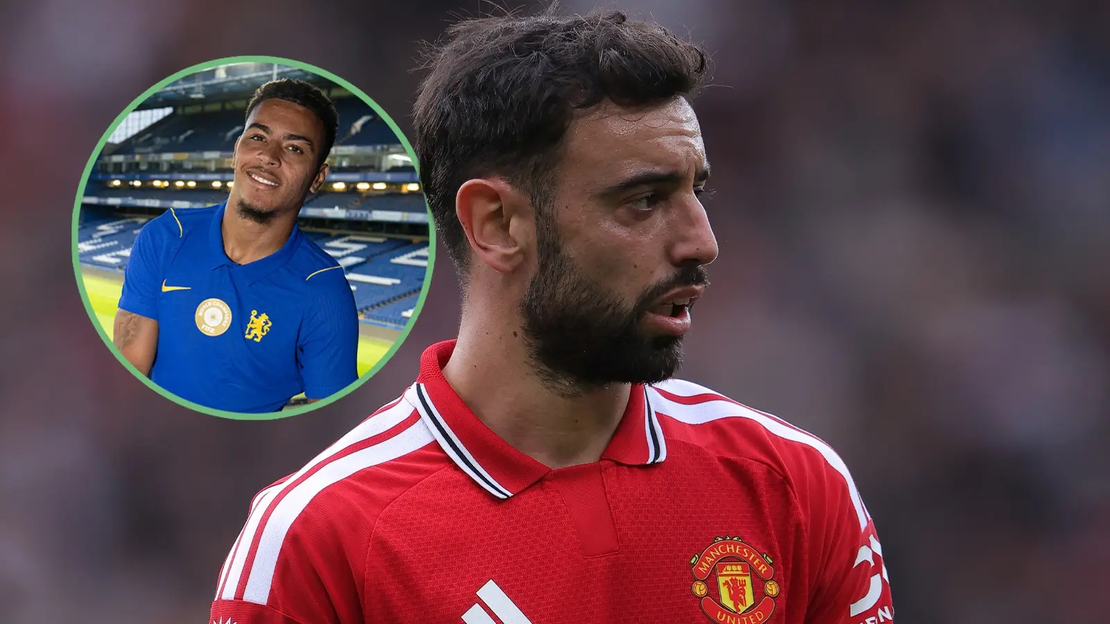
**6/10 – Chelsea**
We like the collar, but the button-down neck and simple look don’t excite us. The lion on the crest is bold but not subtle. On the bright side, this Nike Aero-FIT shirt is made completely from recycled textile waste—great for the planet!
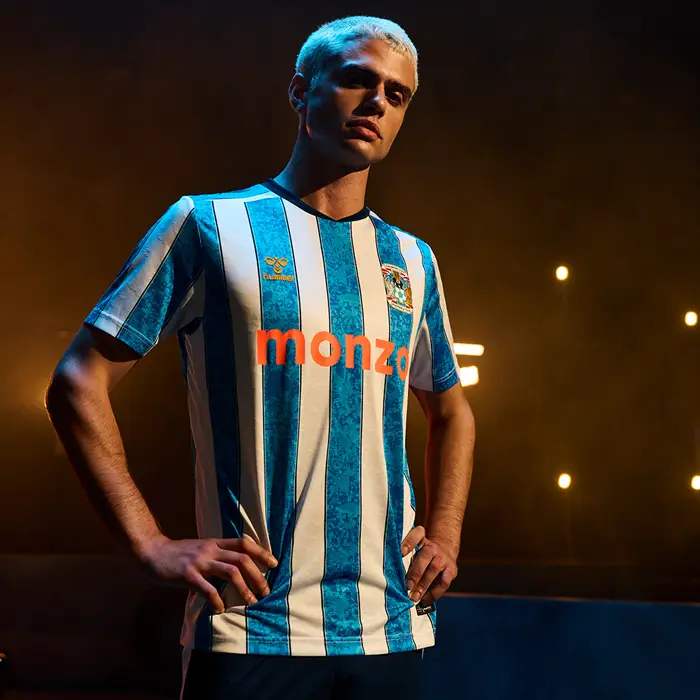
**10/10 – Coventry City**
Coventry’s comeback kit is stunning! Inspired by their 1987 FA Cup-winning team, it features a special four-tone sky blue jacquard pattern with navy pinstripes. Hummel really nailed this one.
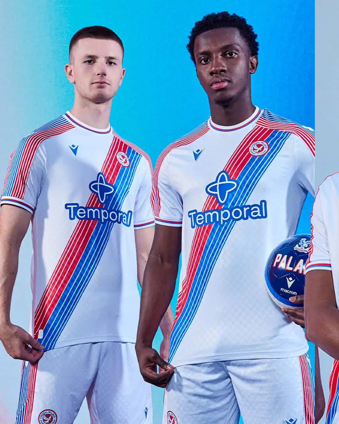
**7/10 – Crystal Palace**
Palace takes the crown for best neckline, though the new sponsor logo isn’t our favorite. The black shirt has a subtle eagle design and pops of red and blue on the collar and cuffs—a nice look overall.
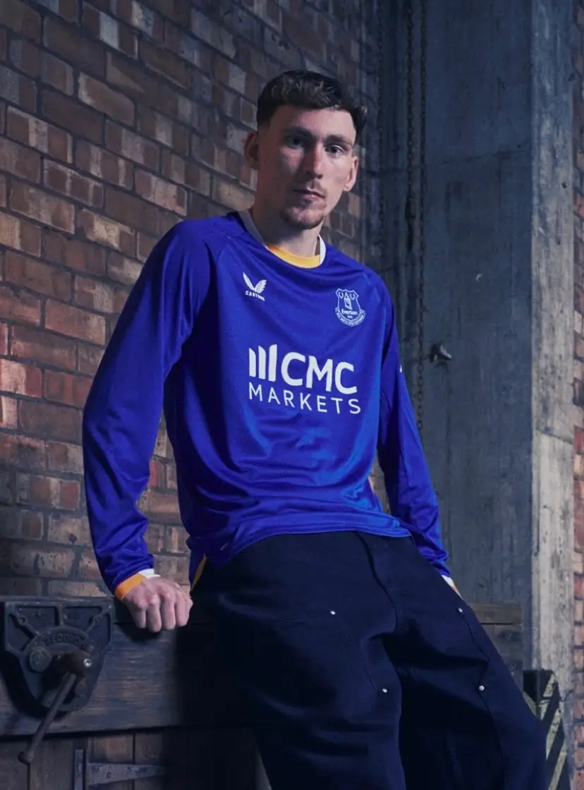
**6/10 – Everton**
Everton’s new sponsor, CMC Markets, isn’t very subtle, and the design doesn’t wow us either. The amber collar and sleeve trims are a nice nod to tradition, though.
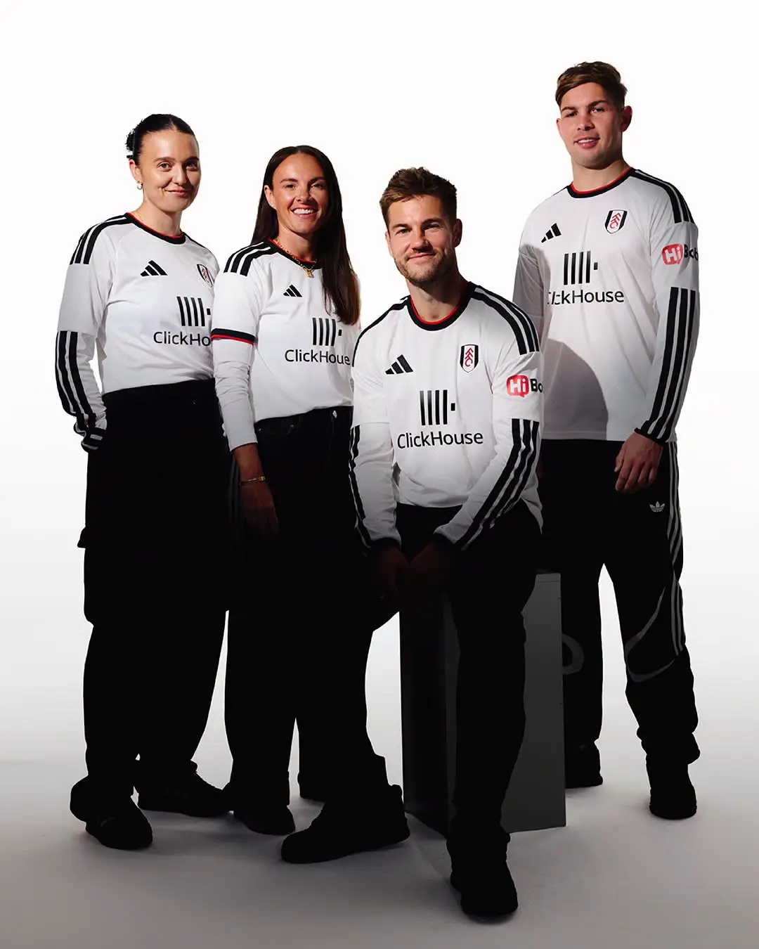
**6/10 – Fulham**
Fulham’s shirt features a unique fabric pattern inspired by the river near Craven Cottage. It’s the first kit with their new sponsor, ClickHouse.
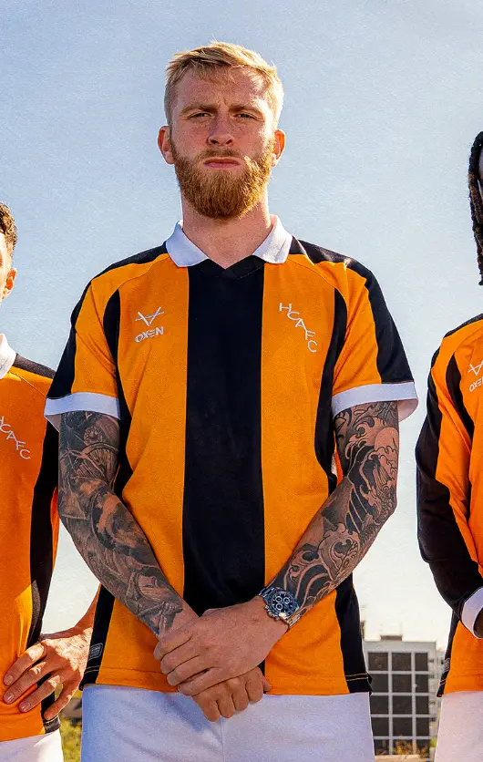
**8/10 – Oxen Sports**
This kit breaks away from templates, mixing a classic white rib collar from the late 70s with modern jacquard details. A cool blend of old and new.
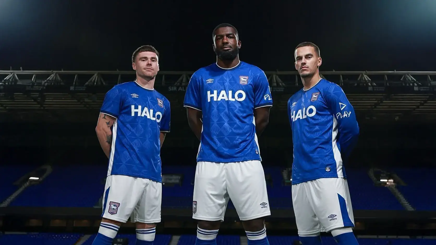
**7.5/10 – Ipswich**
Umbro delivers again with a shirt inspired by the atmosphere of evening games under the lights at Portman Road. Plus, the club is supporting local youth football with grants for kits—big respect!
**8/10 – Leeds**
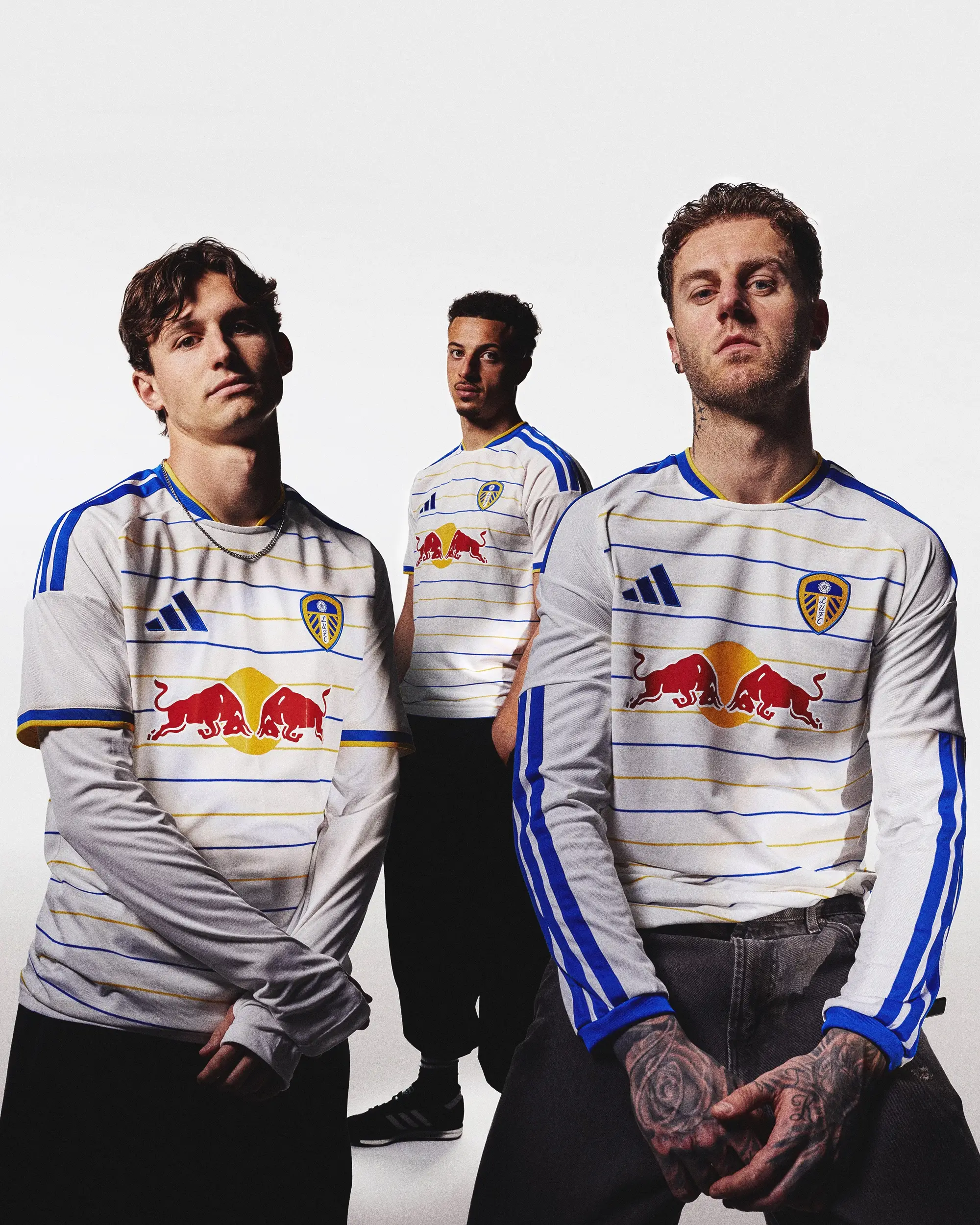
Leeds combines their famous Red Bull logo with blue and yellow pinstripes to celebrate 400 years since the Leeds Town Charter. A modern take on a classic look we really like.
**7.5/10 – Liverpool**
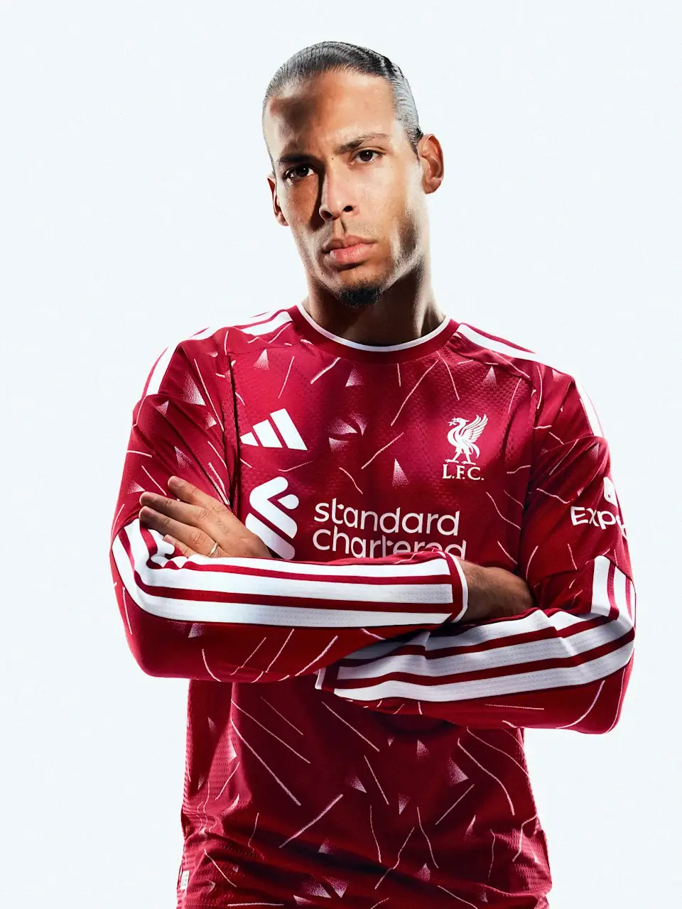
Inspired by Liverpool’s 1989-90 title-winning season, this Adidas design with its iconic geometric pattern looks solid, especially in long sleeves. Not our favorite, but certainly decent.
**8/10 – Manchester City**
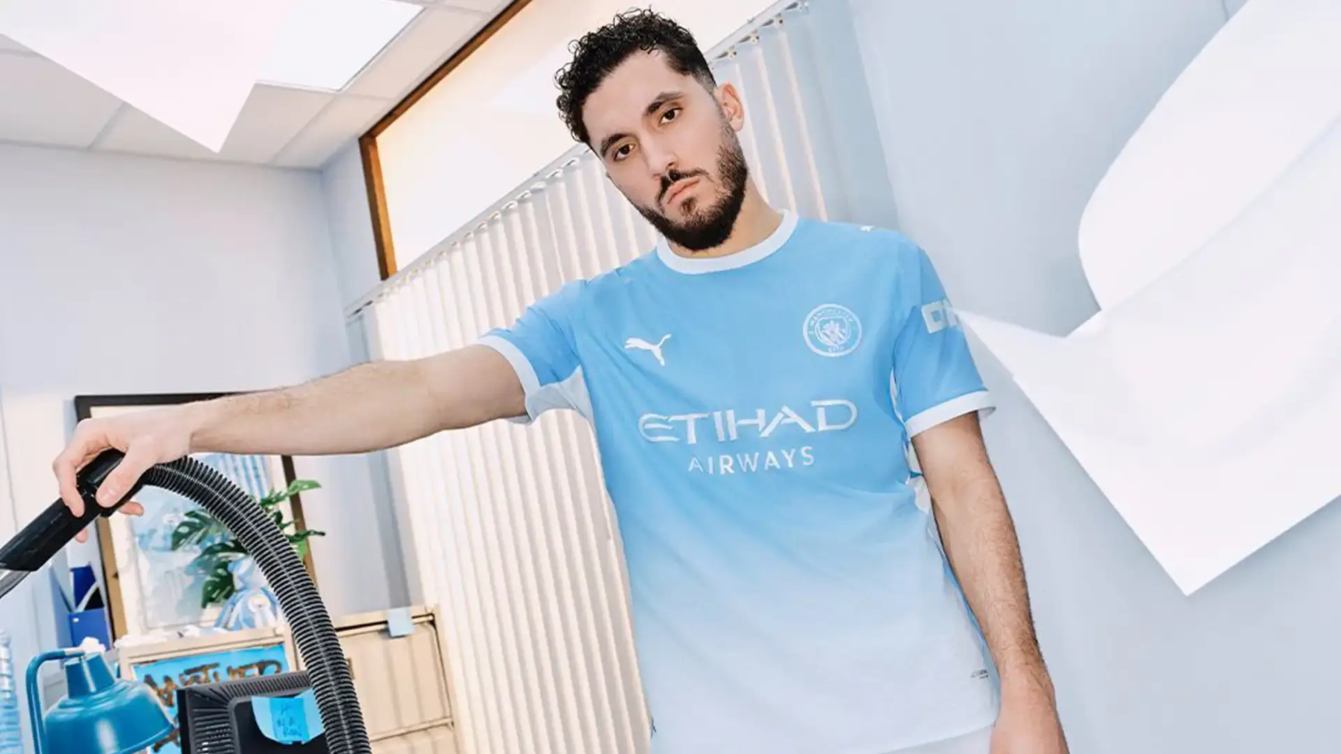
City’s kit features a gradient that fades from dark on the shoulders to lighter below, showing the club’s ambition. Sleek and modern—one of their best in years.
**6.5/10 – Manchester United**
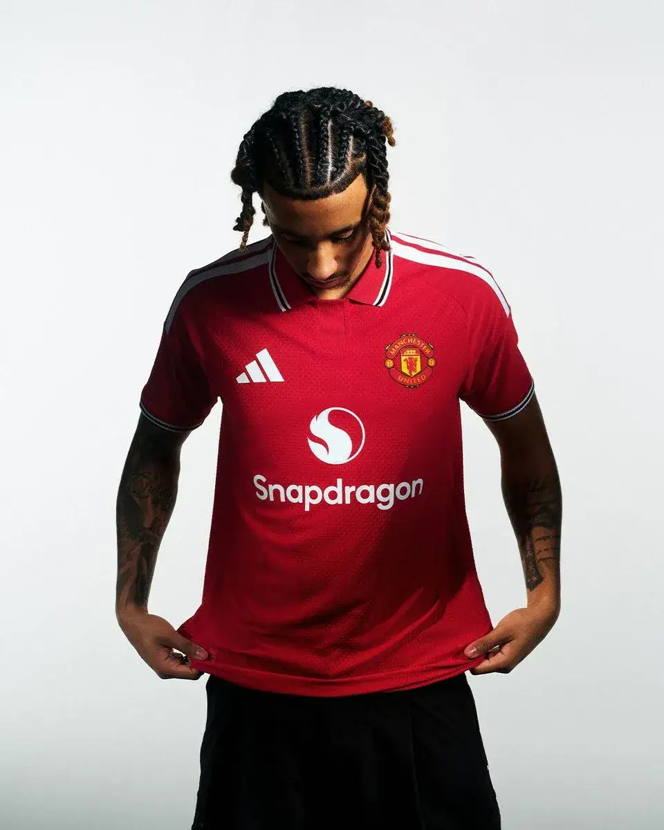
United’s shirt nods to their 1977 FA Cup-winning kits with a polo collar and striped cuffs but looks quite similar to last season’s. The club says it’s both nostalgic and new—we’re not fully sold.
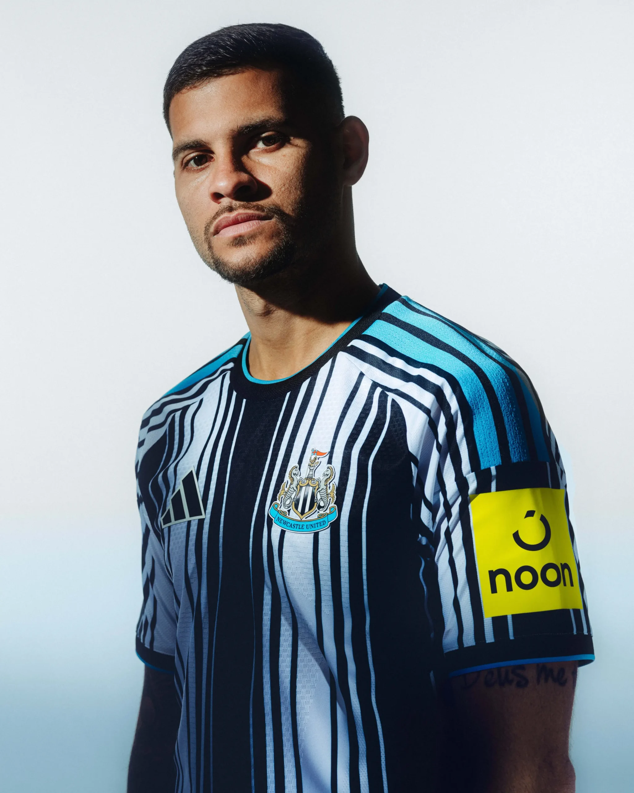
**5/10 – Newcastle**
Newcastle’s kit is one of the summer’s most talked-about releases, with many comparing it to a barcode. The club calls it “future-thinking,” though we’re not so sure.
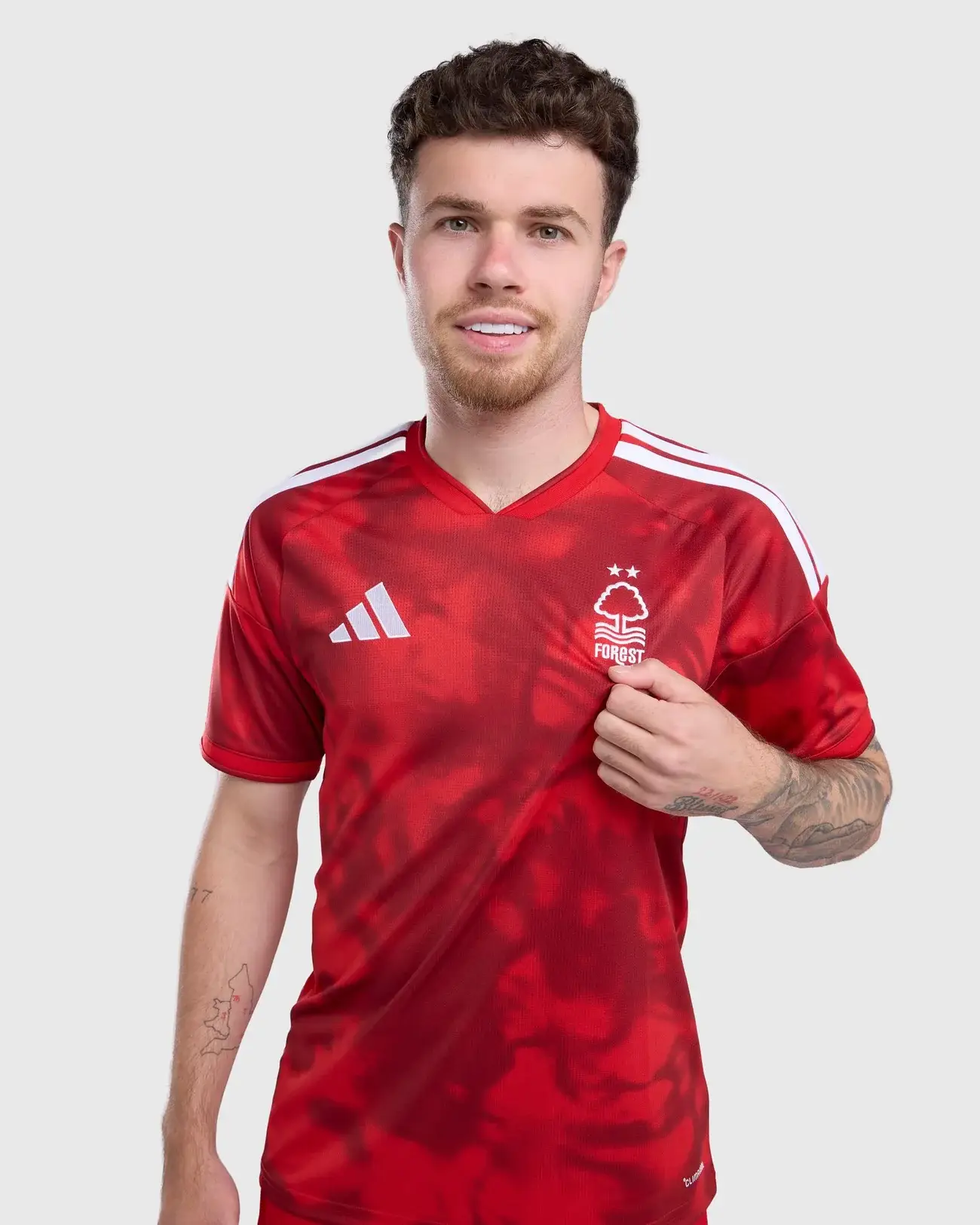
**6/10 – Nottingham Forest**
Forest went for a red base with a tonal pattern inspired by mist and their famous pre-match anthem. It’s decent but not standout.
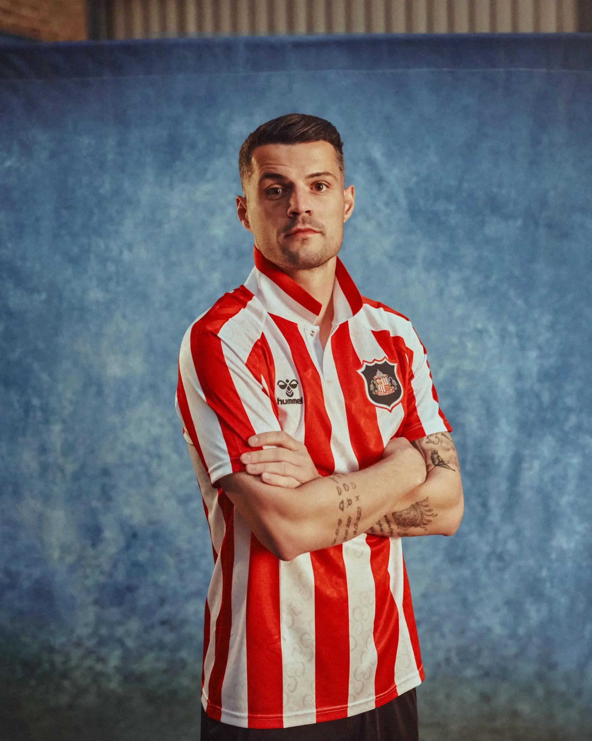
**10/10 – Sunderland**
Waiting until late July paid off. Sunderland’s shirt features a clever “S” pattern formed by FA Cup handles and a special nod to the 1937 winning lineup inside the collar. Simply beautiful.
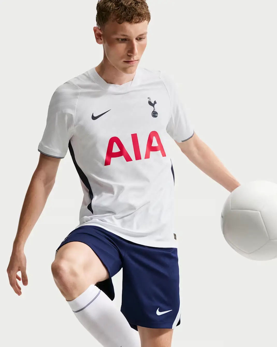
**6/10 – Tottenham**
Tottenham’s new shirt pays tribute to their heritage, with navy trims under the arms as a nice touch. But it looks very similar to previous kits, making it a bit forgettable.
So, which one will you be picking up?